To create a pivot table in Excel, click any cell in your data, go to Insert > PivotTable (choose From Table/Range if a menu opens), leave New Worksheet selected, and click OK. Excel adds a blank pivot table on a new sheet and opens the PivotTable Fields pane. Check a text field such as Region to list it down the left side, then check a number field such as Revenue to total it. That is a working pivot table, and you never typed a formula.
A pivot table (Microsoft writes it as one word, PivotTable) is a summary report that groups the rows of a list and calculates totals, counts, or averages for each group. You can drag fields around to answer a different question in seconds, and your original data is never changed. The rest of this guide walks through each step, shows a worked example with real numbers, and covers Excel for Mac, Excel for the web, Recommended PivotTables, the PIVOTBY function, and the problems beginners most often hit.
What you need and which versions this covers
The main steps are written for Excel for Microsoft 365 on Windows, which is what most readers have in 2026. Excel 2024, 2021, and 2019 for Windows use the same Insert > PivotTable command, though a few labels and menus can differ slightly in older versions. Separate short sections below cover Excel for Mac and Excel for the web, because their menus are different enough that mixing them into one list would be confusing.
Before you start, you need:
- A list of records. Each row should be one item (one order, one expense, one survey response), and each column should hold one kind of information.
- One header row. Every column needs a short, unique name in the top row, such as Order Date, Region, Product, Units, and Revenue. Avoid merged cells and two-row headers.
- Consistent data in each column. Don’t mix dates and text in the same column, and keep number columns purely numeric. Microsoft notes that a numeric field that Excel reads as text will be counted rather than summed.
- No blank rows or columns inside the data. A blank row can make Excel stop the selection early, which silently leaves records out.
A few terms you will see throughout:
- Field: a column from your source data. The header becomes the field name.
- Areas: the four boxes at the bottom of the PivotTable Fields pane, called Filters, Columns, Rows, and Values. Where you put a field decides how the report looks.
- Pivot cache: the snapshot of your data that a PivotTable reads from. Because it reads the snapshot, a pivot table doesn’t change when you edit the source until you refresh it.
Contents
- How to create a pivot table in Excel for Windows
- Worked example: sales by region and product
- Use Recommended PivotTables for a quick start
- Change calculations, sort, group, and filter
- Refresh a pivot table when the data changes
- Create a pivot table in Excel for Mac
- Create a pivot table in Excel for the web
- PIVOTBY: the formula alternative
- Troubleshooting
- How to move, undo, or delete a pivot table
- Frequently Asked Questions
How to create a pivot table in Excel for Windows
These steps use Excel for Microsoft 365 on Windows. The example data is a small order list with the columns Order Date, Region, Product, Units, and Revenue, shown in full in the worked example below.
Step 1: Turn your data into an Excel table (recommended)
Click any cell inside your data and press Ctrl + T, or go to Insert > Table. Make sure My table has headers is checked, then click OK. Your data gets banded rows and filter arrows in the header. On the Table Design tab, type a name such as Orders in the Table Name box.
This step is optional, but it saves trouble later. Microsoft recommends a table as the source because rows you add to a table are included the next time you refresh the pivot table, and new columns show up in the field list. With a plain range, you would have to change the source range by hand every time the data grows.
Step 2: Click a cell inside the data
Click any single cell in the table. You don’t need to select the whole block; Excel detects the table or the surrounding range automatically. If you are using a plain range instead of a table and it has a gap, select the whole block, including the header row, before moving on.
Step 3: Go to Insert > PivotTable
Click the Insert tab on the ribbon, then click PivotTable at the far left. In current Microsoft 365 builds the PivotTable button has a drop-down arrow with source choices: From Table/Range, From External Data Source, From Data Model, and From Power BI. For a normal worksheet list, choose From Table/Range. Clicking the top half of the button does the same thing.
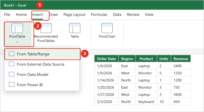
The other sources are for specific situations. From External Data Source connects to a database or another file. From Data Model builds a pivot table from several related tables at once. From Power BI connects to published Power BI datasets your organization lets you use, and your organization’s name may appear in that menu item.
Step 4: Check the range and choose where the pivot table goes
The PivotTable from table or range dialog box opens (older versions call it Create PivotTable). Check two things:
- Table/Range: this should show your table name (for example, Orders) or a range such as Sheet1!$A$1:$E$13. If the range stops short of your last row or column, click in the box and drag over the correct cells.
- Choose where you want the PivotTable to be placed: keep New Worksheet for your first pivot table. It keeps the report away from your data, so it can grow without covering anything. Choose Existing Worksheet and click a cell in the Location box only when you have plenty of empty space for it.
Leave Add this data to the Data Model unchecked unless you need to combine several tables or work with very large data. Then click OK.

Step 5: Add fields to Rows and Values
Excel opens a new sheet with an empty pivot table placeholder on the left and the PivotTable Fields pane on the right. The empty placeholder is normal; Excel is waiting for you to pick fields.
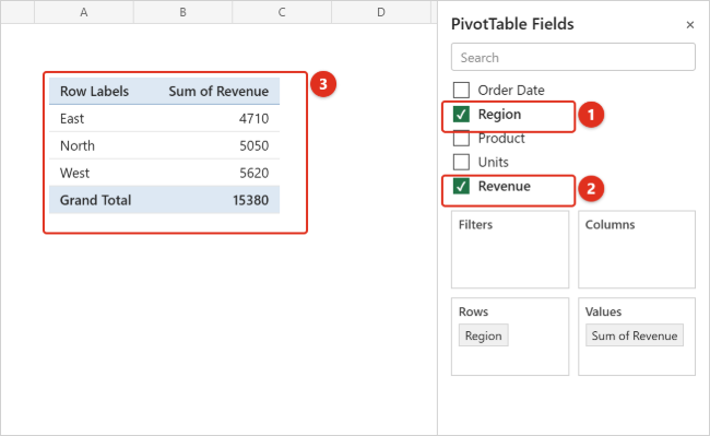
In the list of field names at the top of the pane, check Region, then check Revenue. Excel places fields automatically: text fields go to Rows, numeric fields go to Values, and date and time fields go to Columns. You now see one row per region, a Sum of Revenue column, and a Grand Total row at the bottom.
To put a field somewhere else, drag it from the field list (or from one area) into the area you want. For example, drag Product into Columns to split each region’s revenue by product. To remove a field, uncheck it or drag it out of the area box.
Step 6: Check the calculation in Values
Look at the heading Excel created. Sum of Revenue means Excel is adding the numbers, which is usually what you want for money or quantities. If it says Count of Revenue instead, Excel thinks at least some cells in that column are text. See Troubleshooting for the fix, or change the calculation as described in Change calculations.
Step 7: Format the numbers
In the Values area, click the arrow next to Sum of Revenue, choose Value Field Settings, then click Number Format. Pick Currency or Number with a thousands separator and click OK twice. Formatting this way applies to the whole field, so it stays correct when the pivot table changes shape. Formatting the cells directly can be lost when you rearrange or refresh.
Step 8: Save the workbook
Save the file as a normal Excel workbook (.xlsx). The pivot table and its cache are saved with it. Whenever you change the source data later, refresh the pivot table, as covered in Refresh a pivot table.
Worked example: sales by region and product
Here is the sample data used in this guide, formatted as an Excel table named Orders. Typing it into a blank sheet is a good way to practice, because you can check your results against the totals below.
| Order Date | Region | Product | Units | Revenue |
|---|---|---|---|---|
| 1/6/2026 | East | Laptop | 2 | 2400 |
| 1/9/2026 | West | Monitor | 5 | 1250 |
| 1/14/2026 | North | Laptop | 1 | 1200 |
| 1/20/2026 | East | Monitor | 3 | 750 |
| 1/27/2026 | West | Laptop | 3 | 3600 |
| 2/3/2026 | North | Keyboard | 10 | 450 |
| 2/10/2026 | East | Keyboard | 8 | 360 |
| 2/17/2026 | West | Keyboard | 6 | 270 |
| 2/24/2026 | North | Monitor | 4 | 1000 |
| 3/3/2026 | East | Laptop | 1 | 1200 |
| 3/10/2026 | West | Monitor | 2 | 500 |
| 3/17/2026 | North | Laptop | 2 | 2400 |
Question 1: How much revenue came from each region?
Put Region in Rows and Revenue in Values. The result:
| Row Labels | Sum of Revenue |
|---|---|
| East | 4,710 |
| North | 5,050 |
| West | 5,620 |
| Grand Total | 15,380 |
Regions are listed alphabetically by default. To rank them, right-click any number in the Sum of Revenue column and choose Sort > Sort Largest to Smallest. West moves to the top.
Question 2: Which product sells best in each region?
Keep Region in Rows and Revenue in Values, then drag Product into Columns. You get a grid, often called a two-dimensional or cross-tab report:
| Sum of Revenue | Keyboard | Laptop | Monitor | Grand Total |
|---|---|---|---|---|
| East | 360 | 3,600 | 750 | 4,710 |
| North | 450 | 3,600 | 1,000 | 5,050 |
| West | 270 | 3,600 | 1,750 | 5,620 |
| Grand Total | 1,080 | 10,800 | 3,500 | 15,380 |
Laptops bring in the same amount everywhere, so the difference between regions comes from monitors and keyboards. That is the kind of pattern that is hard to spot in the raw list.
Question 3: What share of total revenue does each region contribute?
Go back to the Question 1 layout. Right-click a number in the Sum of Revenue column, choose Show Values As, then % of Grand Total. East shows 30.62%, North 32.83%, and West 36.54%. If you want the dollar amount and the percentage side by side, drag Revenue into Values a second time and apply Show Values As to just one of the two copies.
Question 4: How does revenue change month to month?
Put Order Date in Rows and Revenue in Values. Excel for Microsoft 365 usually groups dates automatically into months (and years or quarters when the data spans them). If you see individual dates instead, right-click any date in the pivot table, choose Group, select Months under By, and click OK. The sample data gives January 9,200, February 2,080, and March 4,100.
Use Recommended PivotTables for a quick start
If you are not sure which fields to use, let Excel suggest layouts. Microsoft describes Recommended PivotTables as a good starting point for beginners: Excel matches your columns to sensible areas and builds a ready-made report you can then adjust.
- Click any cell in your data or table.
- Go to Insert > Recommended PivotTables (the button next to PivotTable).
- Click each suggestion on the left to preview it.
- Click OK. Excel creates the pivot table on a new sheet and opens the PivotTable Fields pane so you can change it.
Suggestions depend on your data and won’t always answer your exact question, so treat them as a draft. Microsoft notes that PivotTable recommendations are part of Microsoft 365’s connected experiences and use AI services; if you or your organization has turned off connected experiences, recommendations aren’t available. In that case, create the pivot table manually with the steps above. Microsoft also says that, with the right license, you can ask Copilot in Excel to help build a PivotTable; see our guide to using Copilot in Excel to analyze a table for that route.
Change calculations, sort, group, and filter
Change Sum to Count, Average, Max, or Min
In the Values area of the PivotTable Fields pane, click the arrow next to the field (for example, Sum of Revenue) and choose Value Field Settings. On the Summarize Values By tab, pick Count, Average, Max, Min, or another function and click OK. You can also right-click a number in the pivot table and use Summarize Values By. Excel renames the heading to match, such as Average of Revenue.
Microsoft suggests waiting to rename headings until your layout is final, because changing the calculation rewrites the name. A quick way to clean up names at the end is Ctrl + H (Find and Replace): find “Sum of ” and replace it with nothing. Excel won’t accept a custom name that exactly matches a field name, so a leading or trailing space or a slightly different word may be needed.
Show percentages and running comparisons
The Show Values As tab in the same dialog (or the Show Values As right-click menu) converts numbers into % of Grand Total, % of Column Total, % of Row Total, % of Parent Total, and other comparisons, without changing your source data.
Sort the report
Right-click a value and choose Sort to order rows from largest to smallest or the reverse. To sort the labels alphabetically, click the arrow beside Row Labels at the top of the pivot table and choose a sort order.
Group dates or numbers
Right-click a date or number label and choose Group. In the Grouping box, set Starting at and Ending at if needed, then pick periods such as Months, Quarters, and Years under By, or type an interval for numbers (for example, 100 to group order sizes into bands of 100). To group specific text items, hold Ctrl, click the items, right-click, and choose Group. Right-click a group and choose Ungroup to undo it. Microsoft’s guide to grouping data in a PivotTable covers naming groups as well.
Filter the whole report
Drag a field into the Filters area to add a drop-down above the pivot table. Choosing one item from it limits the entire report, for example showing only Laptop sales. Check Select Multiple Items in that drop-down to include more than one. For clickable filter buttons, select the pivot table and choose PivotTable Analyze > Insert Slicer.
Add a chart
Select any cell in the pivot table, go to Insert > PivotChart, pick a chart type, and click OK. A PivotChart stays linked to the pivot table, so filtering or rearranging the table changes the chart too. If you only need a static chart from ordinary data, our guide on making a line graph in Excel covers that approach.
Refresh a pivot table when the data changes
Because a pivot table reads from its cache, editing the source doesn’t automatically change it in most versions. You have several ways to update it, according to Microsoft’s Refresh PivotTable data guide:
- Refresh one pivot table: right-click anywhere in it and choose Refresh, or select it and click Refresh in the Data group on the PivotTable Analyze tab. The keyboard shortcut is Alt + F5.
- Refresh every pivot table in the workbook: on the PivotTable Analyze tab, click the arrow under Refresh and choose Refresh All.
- Refresh whenever the file opens: select the pivot table, click PivotTable Analyze > Options, open the Data tab, and check Refresh data when opening the file.
- Auto Refresh (Insider builds only): Microsoft says newer Excel versions can refresh PivotTables connected to local workbook data automatically, but as of this writing the feature is available to Microsoft 365 Insider program participants. Where it exists, an Auto Refresh button appears in the Data group, and the setting applies to every pivot table that shares the same source. If you don’t see the button, use the manual options above.
If your column widths jump around after each refresh, open PivotTable Analyze > Options, go to the Layout & Format tab, and adjust Autofit column widths on update and Preserve cell formatting on update.
Create a pivot table in Excel for Mac
These steps follow Microsoft’s instructions for Excel for Microsoft 365 for Mac. The ideas are identical, but some dialog names differ from Windows.
Step 1: Select a cell in your data
Click any cell in your table or range. As on Windows, an Excel table (Insert > Table) makes a better source because new rows are picked up on refresh.
Step 2: Go to Insert > PivotTable
Click Insert on the ribbon, then PivotTable. The Create PivotTable dialog box opens with your table name or range already filled in.
Step 3: Choose a location and click OK
Under Choose where you want the PivotTable report to be placed, select New Worksheet, or Existing Worksheet and click the cell where it should start. Click OK. Excel creates a blank pivot table and shows the PivotTable Fields list.
Step 4: Add and arrange fields
Check field names to add them (text to Rows, numbers to Values, dates to Columns by default), or drag them between the areas.
Step 5: Change the calculation if needed
Click the arrow next to the field in the Values area and choose Field Settings. Mac uses the labels Summarize by and Show data as where Windows says Summarize Values By and Show Values As. To refresh, right-click in the pivot table and choose Refresh, or use the Refresh arrow on the PivotTable Analyze tab for Refresh All.
For suggestions on a Mac, use Insert > Recommended PivotTable, choose a layout, and click OK.
Create a pivot table in Excel for the web
Excel for the web, which runs in a browser at office.com or from OneDrive and SharePoint, uses a side pane instead of a dialog box.
Step 1: Open the workbook and select your data
Open the workbook in Excel for the web and click a cell in your table, or select the range including headers.
Step 2: Open the Insert PivotTable pane
Click Insert > PivotTable. The Insert PivotTable pane opens on the right with your data shown under Source. To change it, click the Source box, select different cells on the sheet (or type a range), and press Enter.
Step 3: Create your own or pick a recommendation
On the Create your own PivotTable card, choose New sheet or Existing sheet. Alternatively, choose New sheet or Existing sheet on one of the recommended PivotTable cards below it. Microsoft notes that recommended PivotTables in Excel for the web are available only to Microsoft 365 subscribers.
Step 4: Add fields
In the PivotTable Fields pane, check fields or drag them into Rows, Columns, Values, and Filters. To change Sum to another function, right-click a value and choose Summarize Values By; for percentages, right-click and choose Show Values As. To update after editing the data, right-click the pivot table and choose Refresh.
PIVOTBY: the formula alternative
Excel for Microsoft 365 also has a PIVOTBY function, which builds a similar summary with a formula instead of the PivotTable tool. Microsoft is clear that PIVOTBY can produce similar output but isn’t directly related to Excel’s PivotTable feature. Its basic form is:
=PIVOTBY(row_fields, col_fields, values, function)
With the sample table, typing =PIVOTBY(Orders[Region], Orders[Product], Orders[Revenue], SUM) into an empty cell returns the same region-by-product grid shown in Question 2, including totals. The result is a dynamic array that “spills” into the cells below and to the right, so leave room for it. Optional arguments control headers, totals and subtotals, sort order, and a filter, and are described on Microsoft’s PIVOTBY function page.
Which should you use? Choose a PivotTable when you want to explore by dragging fields, add slicers or PivotCharts, or hand the report to someone who doesn’t write formulas. Choose PIVOTBY when you want a summary that recalculates like any other formula, sits inside a larger formula-driven sheet, or feeds other functions. If PIVOTBY returns a #NAME? error, your version of Excel doesn’t include it yet; Excel 2019 and earlier perpetual versions don’t have it, so use a PivotTable instead.
For simpler one-off totals, you may not need either tool. Functions such as SUMIF can total one category at a time, as shown in our guide on how to sum a column in Excel.
Troubleshooting
Excel shows Count instead of Sum
Excel counts a value field when it treats the column as text. Common causes are numbers stored as text (often from imports, marked with a small green triangle), blank cells, or stray words such as “n/a” in the column. Fix the source cells, refresh the pivot table, then change the field to Sum in Value Field Settings.
New rows or edits don’t appear
Refresh the pivot table first. If new rows still don’t show, the source is probably a fixed range that ends above them. Click inside the pivot table, choose PivotTable Analyze > Change Data Source, and select the full range, or convert the data to an Excel table so future rows are included automatically.
The PivotTable Fields pane disappeared
The pane only shows while a cell inside the pivot table is selected. Click inside the pivot table. If it still doesn’t appear, click Field List on the PivotTable Analyze tab to turn it back on.
“The PivotTable field name is not valid” error
This message usually means a column in the selected range has no header, or the range includes an empty column. Make sure every column has a non-blank label in the header row, check the Table/Range box in the dialog, and try again.
The pivot table is missing some data or includes extra blank rows
A blank row or column in the middle of the data can cut off the range. If you selected whole columns (such as A:E) instead, the pivot table can show a “(blank)” item. Remove gaps from the source, or point the pivot table at an Excel table instead.
The same category appears twice
“West” and “West ” (with a trailing space) or a misspelling are different values to Excel, so they become separate rows. Clean up the labels in the source data and refresh.
The PivotTable button is grayed out
Ribbon commands are unavailable while you are typing in a cell, so press Enter or Esc first. A protected sheet or workbook can also block inserting a pivot table; the owner needs to unprotect it under the Review tab.
Recommended PivotTables aren’t available
In Excel for the web, recommended PivotTables require a Microsoft 365 subscription. On any platform, they depend on Microsoft 365 connected experiences, which may be turned off in your privacy settings or by your organization. Create the pivot table manually instead.
How to move, undo, or delete a pivot table
Creating a pivot table never changes the source data, so experimenting is safe. If you drag a field into the wrong place, press Ctrl + Z or just drag it back out of the area. To start the layout over, uncheck every field in the list.
To move a pivot table, click inside it and choose PivotTable Analyze > Move PivotTable, then pick a new location.
To delete one, select the entire pivot table range and press Delete. Microsoft notes that this doesn’t affect other data, pivot tables, or charts around it. If the pivot table sits on its own sheet with nothing else you need, right-click the sheet tab and choose Delete instead. Check that sheet first, because deleting a sheet can’t be undone with Ctrl + Z.
Frequently Asked Questions
What is a pivot table used for?
A pivot table summarizes a long list into totals, counts, averages, or percentages by category, such as revenue by region, expenses by month, or orders by salesperson. You can rearrange it by dragging fields, so one data set can answer many questions without new formulas.
Does a pivot table change my original data?
No. A pivot table works from a snapshot of your data called the pivot cache. Your source rows stay exactly as they are, and deleting the pivot table leaves them untouched.
Why doesn’t my pivot table update automatically?
In most Excel versions a pivot table only updates when you refresh it. Right-click it and choose Refresh, press Alt + F5 on Windows, or turn on Refresh data when opening the file in PivotTable Options. Automatic refresh for local workbook data is currently limited to Microsoft 365 Insider builds.
Can I make a pivot table from more than one sheet?
Yes, if the sheets hold related tables. Format each one as an Excel table, then use Insert > PivotTable > From Data Model, or check Add this data to the Data Model when you create the pivot table, and relate the tables by a shared column. For data split across identical sheets, combine it into one table first, for example with Power Query.
What’s the difference between Rows and Columns?
Fields in Rows list their items down the left side, one per row. Fields in Columns spread their items across the top. Long lists such as customer names usually work better in Rows; short lists such as product types or years fit well in Columns.
Can I create a pivot table on an iPhone or iPad?
Microsoft documents pivot table creation in Excel on iPad (version 2.82.205.0 and later) through Insert > PivotTable. For complex reports, a computer is easier, and pivot tables you build on a computer can still be viewed on mobile.
Is a pivot table better than the Subtotal command?
They solve different problems. Subtotal inserts total rows directly into your sorted data and groups it, which is handy for printing a list with section totals; our guide on grouping rows in Excel shows how. A pivot table builds a separate report you can rearrange, filter, and chart without touching the source.
How many rows can a pivot table handle?
Lists with tens of thousands of rows are normal pivot table material. For very large data sets, or data spread across several related tables, Microsoft points to the Data Model option (Insert > PivotTable > From Data Model). In practice, speed depends on your computer’s memory and how clean the source data is.
Next steps
Build your first pivot table from a copy of real data you work with, keep it to one row field and one value field until the totals look right, and then add columns, filters, or a PivotChart one at a time. Once the layout answers your question, check that it refreshes correctly after you add a new row. Microsoft’s own guide to creating a PivotTable to analyze worksheet data is a useful reference for the Data Model and Power BI sources if you need them later.

Kermit Matthews is a freelance writer based in Philadelphia, Pennsylvania with more than a decade of experience writing technology guides. He has a Bachelor’s and Master’s degree in Computer Science and has spent much of his professional career in IT management.
He specializes in writing content about iPhones, Android devices, Microsoft Office, and many other popular applications and devices.