To make a bar graph in Excel, select your data including the header row, then go to Insert > Insert Column or Bar Chart > 2-D Bar > Clustered Bar. Excel places a horizontal bar chart on the sheet right away, using the first column for the category labels and the other columns for the bars. From there you can add data labels, sort the bars from largest to smallest, and switch to a stacked or column layout in a couple of clicks.
This guide walks through the whole process with sample data: choosing between bar and column charts, picking clustered, stacked, or 100% stacked, formatting the axis and labels, putting the bars in the order you want, and fixing the problems people hit most often. Separate sections cover Excel for Mac and Excel for the web.
What you need and which versions this covers
- Main steps: Excel for Microsoft 365 on Windows (the current subscription version). Excel 2024, 2021, 2019 and 2016 for Windows use the same Insert tab commands, although the ribbon may look slightly different.
- Excel for Mac (Microsoft 365, 2024 and 2021): covered in its own section, because the chart buttons and formatting pane work a little differently.
- Excel for the web (free in a browser with a Microsoft account): covered in its own section. It can make bar graphs, but formatting happens in a Chart task pane rather than the desktop panes.
- Data: a small table with labels in one column and numbers in one or more columns next to it. You do not need any add-ins or a particular subscription tier to make a basic bar graph.
Two terms come up a lot. A category is one label you are comparing, such as a product, region, or team. A data series is one set of numbers, usually one column, such as Q1 sales. Each series gets its own color in the chart.
Contents
- Bar graph or column chart: which one Excel calls what
- Set up your data
- Make a bar graph in Excel for Windows
- Faster ways: Recommended Charts, Alt + F1 and F11
- Clustered, stacked or 100% stacked: how to choose
- Format the bar graph
- Sort the bars and fix the upside-down order
- Add, remove, or reorder data later
- Worked example: survey results as a 100% stacked bar
- Make a bar graph in Excel for Mac
- Make a bar graph in Excel for the web
- Troubleshooting
- Frequently Asked Questions
Bar graph or column chart: which one Excel calls what
People often say “bar graph” for any chart made of rectangles, but Excel separates them into two families:
- Column chart: vertical bars. Categories run along the bottom (horizontal) axis and values go up the side.
- Bar chart: horizontal bars. Categories run down the left (vertical) axis and values run along the bottom.
Both live under the same button, Insert Column or Bar Chart, and you can switch between them at any time without losing your formatting choices for the data. Microsoft suggests a bar chart when the axis labels are long or when the values are durations. Horizontal bars give long names like “Retail Partners” room to sit on one line, while a column chart would squeeze or tilt them. Column charts are the usual choice when the categories are points in time, such as months or years, because people read time from left to right.
| Your data | Better choice | Why |
|---|---|---|
| Long category names (products, departments, survey questions) | Bar chart | Labels stay horizontal and readable |
| Ranked list, such as top 10 customers | Bar chart | Largest at the top reads like a leaderboard |
| Months, quarters, or years | Column chart (or a line graph) | Time reads naturally left to right |
| Many categories (more than about 15) | Bar chart | The chart can grow taller instead of cramming labels |
| A trend across many time periods | Line graph | A line shows rises and falls more clearly than dozens of bars |
If you are tracking change over time rather than comparing categories, see how to make a line graph in Excel instead.
Set up your data
Excel builds the chart from the shape of your table, so a minute spent here saves most of the fixes later. The examples in this guide use quarterly sales (in thousands of dollars) for a small business that sells through five channels:
| A | B | C | |
|---|---|---|---|
| 1 | Channel | Q1 | Q2 |
| 2 | Online Store | 48 | 54 |
| 3 | Retail Partners | 35 | 31 |
| 4 | Wholesale | 27 | 30 |
| 5 | Farmers Market | 14 | 18 |
| 6 | Catering | 9 | 12 |
Follow these rules for a clean result:
- Labels in the first column, numbers to the right. Each numeric column becomes one data series (one color of bar).
- One header row. Excel uses the headers (Q1, Q2) as the legend names.
- No blank rows or columns inside the table, and no merged cells. A blank row splits the range Excel detects.
- Real numbers, not text. Values typed with stray spaces or imported as text are ignored by the chart. Numbers that are right-aligned in the cell are usually stored as numbers.
- Leave totals out. A “Total” row would become a giant bar that dwarfs everything else. Chart the detail rows only.
Tip: if you will keep adding rows, click inside the data and press Ctrl + T to turn it into an Excel table first. A chart built from a table picks up new rows you add at the bottom of the table.
Make a bar graph in Excel for Windows
These steps use Excel for Microsoft 365 on Windows and the sample data above.
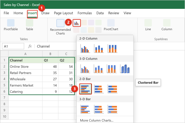
Step 1: Select the data
Click cell A1 and drag to C6 so the labels, headers and numbers are all highlighted. If your table has no blank rows, you can also click any single cell inside it; Excel detects the surrounding range when you insert the chart. To chart only some columns, select the label column, then hold Ctrl and select the number column you want (for example A1:A6 and C1:C6 for Q2 only).
Step 2: Open the Insert tab
Click Insert on the ribbon. Find the Charts group in the middle of the tab. It holds Recommended Charts plus a set of small chart-type buttons.
Step 3: Click Insert Column or Bar Chart
Click the button that shows small vertical bars. Its tooltip reads Insert Column or Bar Chart. A gallery opens with four groups: 2-D Column, 3-D Column, 2-D Bar, and 3-D Bar.
Step 4: Choose Clustered Bar
Under 2-D Bar, point to the first icon to preview it, then click Clustered Bar. You should see a chart appear on the sheet with one horizontal bar per channel for each quarter, a legend showing Q1 and Q2, and a placeholder title. Two new ribbon tabs, Chart Design and Format, appear whenever the chart is selected.
Step 5: Give the chart a real title
Click the Chart Title placeholder once to select it, click again to place the cursor, select the placeholder text, and type something descriptive such as “Sales by channel, Q1 vs Q2 ($ thousands)”. Including the unit in the title saves you from adding a separate axis title. Click anywhere outside the title when you finish.
Step 6: Move and resize the chart
Point to the chart’s border until the pointer becomes a four-headed arrow, then drag the chart so it does not cover your data. Drag a corner handle to resize it. A taller chart gives bars more breathing room when you have many categories. To put the chart on its own sheet, select it and choose Chart Design > Move Chart > New sheet.
That is a finished bar graph. The rest of this guide covers choosing a different layout, formatting, and ordering the bars.
Faster ways: Recommended Charts, Alt + F1 and F11
- Recommended Charts: select the data and choose Insert > Recommended Charts. Excel previews a few chart types that suit the data. If a bar chart is not suggested, open the All Charts tab, choose Bar on the left, pick a subtype across the top, and click OK. This dialog is also the easiest place to compare all three bar subtypes with your own data.
- Alt + F1: creates an embedded chart of the selected data on the current sheet instantly. It uses Excel’s default chart type, which is a clustered column chart unless someone changed the default, so you will usually follow it with Change Chart Type (covered below) to turn the columns into bars.
- F11: creates the default chart on a separate chart sheet (a sheet tab that holds only the chart). This is handy for printing a full-page chart. On laptops you may need to hold the Fn key with F11.
Clustered, stacked or 100% stacked: how to choose
Every bar subtype answers a different question about the same numbers. With one data series all three look almost the same, so the choice matters once you have two or more columns of numbers.

| Subtype | What the bars show | Use it when you want to answer | Watch out for |
|---|---|---|---|
| Clustered Bar | One bar per series, side by side within each category | “Did Q2 beat Q1 for each channel?” | Gets crowded beyond three or four series |
| Stacked Bar | Series stacked end to end, so the full bar is the total | “Which channel sold the most over both quarters, and how was it made up?” | Only the first segment starts at zero, so middle segments are hard to compare across bars |
| 100% Stacked Bar | Every bar is the same length (100%), split by each series’ share | “What share of each channel’s sales came in Q2?” | Hides the actual size; a tiny channel and a huge one look the same length |
| 3-D Bar versions | The same layouts with a depth effect | Decorative use only | Perspective makes values harder to read accurately |
In the sample data, the clustered version shows that Retail Partners was the only channel that fell in Q2 (35 to 31). The stacked version shows that Online Store’s two-quarter total of 102 is well ahead of the next channel, Retail Partners at 66. The 100% stacked version shows each channel’s Q1 and Q2 split as shares, which makes it easy to see that Catering and Farmers Market earned more of their sales in Q2.
Switch subtype or swap between bar and column
Click an empty part of the chart, then choose Chart Design > Change Chart Type (or right-click the chart area and choose Change Chart Type). Pick Bar or Column on the left, choose a subtype across the top, and click OK. Titles, data labels and most formatting carry over. For most 2-D charts you can also click a single series first and change only that series, which creates a combination chart; 3-D charts can only change type as a whole.
Swap what the bars and colors represent
If Excel plotted quarters as categories and channels as colors when you wanted the opposite, choose Chart Design > Switch Row/Column. In the sample data, switching gives you two groups (Q1 and Q2) with five colored bars each, which is useful when you want to compare channels within a quarter.
Format the bar graph
When you select a chart in Excel for Windows, three small buttons appear beside its top-right corner: Chart Elements (the plus sign), Chart Styles (the paintbrush), and Chart Filters (the funnel). The same commands are also on the Chart Design tab under Add Chart Element, which is handy if the buttons are hidden. For detailed formatting, double-click any part of the chart (or right-click it and choose the Format command) to open a formatting pane on the right.
Add data labels
Data labels print each bar’s value at the bar, which is often clearer than making readers estimate against the axis.
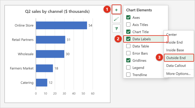
- Click the chart, then click the Chart Elements (+) button.
- Check Data Labels. Values appear on every bar.
- Point to Data Labels and click the arrow to choose a position. For a single-series bar chart, Outside End puts the number just past the end of each bar; Inside End puts it inside the bar’s tip.
To show only one series’ labels, click that series’ bars first, then add data labels. To delete a single label, click it once (all labels in the series are selected), click it again (only that label is selected), and press Delete. For more control, right-click a label, choose Format Data Labels, and under Label Options > Label Contains pick what to show. The Value From Cells check box lets you pull label text from a worksheet range, such as a column of percentages or notes.
Add or edit axis titles
Click Chart Elements (+) and check Axis Titles. Remember that in a bar chart the axes are turned compared with a column chart: the vertical axis on the left holds the categories, and the horizontal axis along the bottom holds the values. Click each “Axis Title” box and type, for example, “Sales ($ thousands)” for the bottom axis. If the category names are obvious, you can delete the vertical axis title to save space.
Link the chart title to a cell
To keep a title up to date automatically, click the chart title, click in the formula bar, type an equal sign (=), click the cell that holds the title text, and press Enter. The title now changes whenever that cell does, which is useful for reports where a cell holds the current month.
Change colors and style
- Whole chart: click the Chart Styles (paintbrush) button. The Style tab applies preset looks; the Color tab applies a color palette. Point to an option to preview it.
- One series: click any bar in that series, then use Format > Shape Fill and choose a color.
- One bar only: click the bar once to select the series, click it a second time to select just that bar, then use Format > Shape Fill. This is a quick way to highlight your own team or the winning product.
Make the bars thicker or thinner
Right-click any bar and choose Format Data Series. Under Series Options:
- Gap Width sets the space between categories as a percentage of bar thickness. Lower numbers make bars fatter; 50% to 80% looks solid for most charts.
- Series Overlap (for clustered bars) controls how much bars in the same category overlap. 0% places them touching side by side; a negative value adds a gap between them.
Set the axis scale and number format
Double-click the numbers along the bottom (the value axis) to open Format Axis. Under Axis Options, the Bounds boxes let you type a fixed Minimum and Maximum, and Units sets the gridline spacing. Expand Number to show values as currency or percentages. Be careful about raising the minimum above zero: in a bar chart, readers judge values by bar length, so starting the axis at, say, 10 makes small differences look dramatic. Keep bar charts starting at zero unless you have a clear reason and label it.
Legend and gridlines
With a single series, the legend adds nothing; uncheck Legend in Chart Elements. With several series, point to Legend and use the arrow to move it to the Top, which leaves more width for bars. To remove gridlines, click one and press Delete, or uncheck Gridlines. Data labels and gridlines do the same job, so many charts look cleaner with labels and no gridlines.
Sort the bars and fix the upside-down order
The most common surprise with Excel bar charts: the first row of your table appears at the bottom of the chart, not the top. Excel plots categories starting from the axis origin, which in a horizontal bar chart is the bottom-left corner. So a table sorted from largest to smallest becomes a chart with the largest bar at the bottom. There are two fixes.
Method 1: Reverse the category order on the chart (data stays as is)
- Double-click the category labels on the left side of the chart (the vertical axis). The Format Axis pane opens on the right.
- Under Axis Options, check Categories in reverse order. The bars flip so your first row is at the top, but the value axis jumps to the top of the chart.
- In the same section, under Horizontal axis crosses, choose At maximum category. The value axis moves back to the bottom.
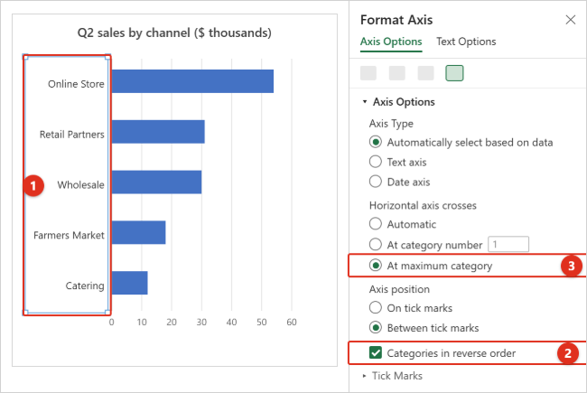
Now the chart order always matches the table order. If you then sort the table from largest to smallest, the chart becomes a ranked list with the biggest bar on top.
Method 2: Sort the source data in the opposite direction
If you would rather not change axis settings, sort the table ascending (smallest to largest). Click a cell in the number column you want to rank by, then choose Data > Sort Smallest to Largest. Because Excel draws the first row at the bottom, the smallest bar sits at the bottom and the largest at the top. The catch is that your table now reads “upside down,” and you must re-sort whenever values change.
For a ranking that updates on its own in Excel for Microsoft 365, you can build a helper table with a formula such as =SORTBY(A2:B6,B2:B6,-1) and chart the helper range, combined with Method 1. When the original numbers change, the helper table re-sorts and the chart follows.
Add, remove, or reorder data later
- Add a row or column next to the data: click the chart. Colored outlines appear around the source range on the sheet. Drag the corner handle of the outline to include the new row or column. If the data is an Excel table, new rows added at the bottom are included automatically.
- Use the Select Data dialog: choose Chart Design > Select Data (or right-click the chart and choose Select Data). In Legend Entries (Series) you can Add, Edit, or Remove a series, and the Horizontal (Category) Axis Labels box controls the category names.
- Change the order of series: in Select Data, pick a series under Legend Entries (Series) and use the Move Up or Move Down arrows. This changes which series sits on the left in a stacked bar, for example.
- Hide a category without deleting it: click the Chart Filters (funnel) button, uncheck the category or series, and click Apply.
Worked example: survey results as a 100% stacked bar
A 100% stacked bar is a common way to show rating-scale survey answers, because every question has the same number of respondents and you care about the split. Suppose 40 employees answered three questions:
| Question | Disagree | Neutral | Agree |
|---|---|---|---|
| I have the tools I need to do my job | 6 | 10 | 24 |
| Meetings are a good use of my time | 18 | 12 | 10 |
| I would recommend working here | 4 | 9 | 27 |
- Select the whole table, including the header row.
- Choose Insert > Insert Column or Bar Chart > 100% Stacked Bar (the third icon under 2-D Bar). Each question becomes one full-width bar, split into Disagree, Neutral and Agree.
- Reverse the category order as shown in the sorting section so the first question appears at the top.
- Recolor the series so they read naturally: select the Disagree segments and choose a red or orange from Format > Shape Fill, gray for Neutral, and blue or green for Agree.
- Add data labels with Chart Elements > Data Labels > Center. They show counts (such as 24), not percentages. To show percentages, add a helper table that divides each count by 40, format it as percent, and point the labels to it with Format Data Labels > Value From Cells, unchecking Value.
- Move the legend to the top and set Gap Width to about 50% so the bars are thick and easy to compare.
The finished chart makes it obvious that the meetings question is the outlier: only 25% agree, compared with 60% and 68% for the other two.
Make a bar graph in Excel for Mac
Excel for Microsoft 365 for Mac (and Excel 2024 and 2021 for Mac) has the same chart types, but you reach a few commands differently.
Step 1: Select the data
Drag across the labels, headers and numbers. To pick separate columns, hold Command while you select the second range.
Step 2: Insert the chart
Click the Insert tab, click the column chart button in the chart area of the ribbon (hover over the icons to see their names, since a narrow window may shrink them), and then click Clustered Bar under 2-D Bar. You can also use Insert > Recommended Charts to preview options first.
Step 3: Add elements from the Chart Design tab
Select the chart, then use Chart Design > Add Chart Element for the chart title, axis titles, data labels, legend, and gridlines. If you don’t see the small Chart Elements and Chart Styles buttons beside the chart that Windows shows, this menu holds the same options. Chart Design also has Change Chart Type, Switch Row/Column, Quick Layout, and the chart style gallery.
Step 4: Format the axis or bars
Click the part you want to change (or pick it from the element list on the Format tab) and choose Format Pane, or Control-click the part and choose its Format command. The pane has the same Categories in reverse order, Gap Width, and number-format options described in the Windows sections above, so the sorting and formatting instructions carry over.
On a Mac, F11 inserts a new chart sheet; depending on your keyboard settings you may need to hold Fn. Press Command + Z to undo a style or layout you don’t like.
Make a bar graph in Excel for the web
Excel for the web runs in your browser at office.com or from OneDrive. It covers the essentials with a different editing panel.
Step 1: Select the data and insert the chart
Select the range, open the Insert tab, and choose the column or bar chart option in the Charts area, then pick Clustered Bar. You can also use Recommended Charts, which Microsoft says is available to Microsoft 365 subscribers in English and several other languages. Alt + F1 also inserts a chart here.
Step 2: Open the Chart task pane
Double-click the chart. The Chart task pane opens on the right with two tabs: Data and Format.
Step 3: Format the chart
On the Format tab, expand Chart Title, Legend, or an axis and use the toggles to show or hide them. To add data labels, go to Format > Series > Data Labels and turn them on; the same area lets you choose what the labels show. To recolor a series, select it and pick a color in the pane. To recolor one bar, right-click that bar and choose a color.
Step 4: Change the data or series order
On the Data tab, the Source box sets the range, and under Setup you can add a field, rename a series, or use the up and down arrows to reorder series. Some advanced options in the desktop panes, such as Value From Cells for data labels, may not be offered in the browser. If you need them, choose Editing > Open in Desktop App and finish there.
Excel for the web also has no Save as Picture command for charts. Our guide to saving an Excel chart as an image covers the desktop command and the browser workarounds.
Troubleshooting
Excel made a column chart instead of a bar chart
You likely used Alt + F1, F11, or the first icon in the gallery (Clustered Column). Select the chart and choose Chart Design > Change Chart Type > Bar. Nothing about the data changes.
The bars are in reverse order
This is Excel’s normal behavior for bar charts. Use Categories in reverse order plus At maximum category on the vertical axis, as described in the sorting section.
The chart shows the wrong things as bars and colors
Use Chart Design > Switch Row/Column. If that does not fix it, open Select Data and check which ranges are listed as series and which as category labels.
Years or ID numbers became a series of bars
When the first column contains numbers (2024, 2025, 2026), Excel may treat it as data rather than labels and draw extra bars. Delete the text in the column’s header cell (leave the top-left cell blank) and recreate the chart, or open Select Data, remove the unwanted series, and set that column as the Horizontal (Category) Axis Labels.
Some bars or categories are missing
Check for numbers stored as text (often flagged with a small green triangle in the cell), blank rows that cut the range short, or filtered and hidden rows. By default, Excel charts don’t plot data in hidden rows. To include them, open Select Data, click Hidden and Empty Cells, and check Show data in hidden rows and columns. Also make sure no category is unchecked in Chart Filters.
Category labels are cut off or skipped
Make the chart taller, shorten the labels in the source cells, or reduce the axis font size from Home while the axis is selected. If Excel shows only every other label, open Format Axis > Labels and under Interval between labels choose Specify interval unit and type 1.
Negative values are confusing
Bars with negative values extend left of zero. To give them their own color, select the series, open Format Data Series > Fill, and check Invert if negative, then choose the second color. You may also want to move the category labels away from the bars with Format Axis > Labels > Label Position > Low.
The chart did not update after you added data
The new rows are outside the chart’s range. Drag the colored outline on the sheet to include them, edit the range in Select Data, or convert the data to an Excel table so future rows are included automatically.
Undo or remove the chart
Press Ctrl + Z (Command + Z on a Mac) right after a change to undo it. To start fresh, click the chart’s border and press Delete; your data in the cells is not affected. To clear manual formatting from one element, right-click it and choose Reset to Match Style.
Frequently Asked Questions
What is the difference between a bar chart and a column chart in Excel?
Only the direction. A bar chart uses horizontal bars with categories on the left; a column chart uses vertical bars with categories along the bottom. Both are under Insert > Insert Column or Bar Chart, and Change Chart Type switches between them.
How do I make a bar graph with two sets of data?
Put both sets in adjacent columns with headers (for example Q1 and Q2), select the labels and both columns, and choose Clustered Bar. Each column becomes its own colored bar, and Excel adds a legend.
How do I put the largest bar at the top?
Sort the data from largest to smallest, then on the vertical axis check Categories in reverse order and set Horizontal axis crosses to At maximum category. Or skip the axis settings and sort the data from smallest to largest instead.
How do I show percentages on a stacked bar chart?
Data labels show the cell values, so build a helper range that divides each value by its row total and formats it as a percentage. Then use Format Data Labels > Value From Cells to point the labels at that range and uncheck Value.
Can I change the color of just one bar?
Yes. Click the bar once to select its series, click it again to select only that bar, and choose a color from Format > Shape Fill. In Excel for the web, right-click the bar and choose a color.
Why is there a gap between my bars, and can I remove it?
The gap is controlled by Gap Width in Format Data Series > Series Options. Lower it toward 0% for thicker bars that nearly touch. A small gap is usually easier to read than none.
Can I copy my Excel bar graph into Word or PowerPoint?
Yes. Select the chart, press Ctrl + C, and paste it into the other app. If you only need a chart inside a Word document, you can also make a bar graph directly in Word, which uses a small built-in spreadsheet for the data.
Does Excel still have cylinder, cone, and pyramid bar charts?
The current Insert gallery shows only 2-D and 3-D bar icons, not separate cylinder, cone, or pyramid charts. To get those shapes, insert a 3-D bar chart, right-click a series, choose Format Data Series, and pick a shape under Series Options. Like other 3-D effects, they make values harder to read accurately.
Next steps
Once your bar graph looks right, right-click the chart and choose Save as Template if you will make similar charts again; the template then appears under Templates in the Insert Chart dialog. Microsoft’s guide to creating a chart from start to finish covers the other chart types if you want to compare options, and its page on adding and removing data labels goes deeper on label formatting.

Kermit Matthews is a freelance writer based in Philadelphia, Pennsylvania with more than a decade of experience writing technology guides. He has a Bachelor’s and Master’s degree in Computer Science and has spent much of his professional career in IT management.
He specializes in writing content about iPhones, Android devices, Microsoft Office, and many other popular applications and devices.