A bar graph is one of the clearest ways to compare numbers, and Word can create one without opening a separate program. Word’s charts are built on a small built-in spreadsheet, so you type your data and the graph updates instantly. This guide covers inserting a bar or column chart, entering data, styling it, and common fixes.
Quick Answer
Go to Insert > Chart, choose Bar (horizontal bars) or Column (vertical bars), pick a style such as Clustered Bar, and click OK. Type your labels and numbers into the spreadsheet window that opens, then close it. Use the Chart Design tab and the + button next to the chart to style it.
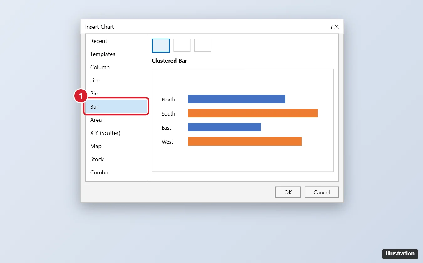
Step 1: Insert the Chart
- Click where you want the graph in your document.
- Go to Insert > Chart (in the Illustrations group).
- Choose a type:
- Bar: horizontal bars, good for long category names.
- Column: vertical bars, good for data over time.
- Pick a variation (Clustered, Stacked, or 100% Stacked) and click OK.
Step 2: Enter Your Data
- A small spreadsheet window opens with sample data.
- Replace the category names in column A (for example, regions or months) and the series names in row 1 (for example, 2025 and 2026).
- Type your numbers in the cells.
- To add or remove rows or columns, drag the blue corner of the data range, or delete unused rows.
- Close the spreadsheet window when finished.
To edit later, click the chart and choose Chart Design > Edit Data (or right-click > Edit Data).
Step 3: Style the Graph
- Chart Elements (+ button): turn on or off the chart title, axis titles, data labels, legend, and gridlines.
- Chart Styles (brush button) or Chart Design > Chart Styles: apply preset looks and color schemes.
- Change colors of one bar: click a bar twice to select just that one, right-click, and choose Fill.
- Change chart type: Chart Design > Change Chart Type.
- Switch rows and columns: Chart Design > Switch Row/Column (open Edit Data first if it’s grayed out).
Step 4: Position and Size
- Drag the corner handles to resize.
- Click the Layout Options button next to the chart to set text wrapping, such as Square or Top and Bottom.
- Add a caption with References > Insert Caption.
Other Ways to Add a Bar Graph
- Copy from Excel: create the chart in Excel, copy it, and paste into Word. Choose Use Destination Theme & Link Data to keep it updated with the Excel file.
- SmartArt offers simple visual lists but isn’t a true data chart.
Frequently Asked Questions
Why is Edit Data grayed out?
The chart may be a picture (pasted as an image) or linked to a file that’s moved. Insert a new chart, or relink it with Edit Data > Edit Data in Excel.
Do I need Excel installed?
Word uses a built-in data grid. Some features, like editing in the full Excel window, require Excel.
Can I make a bar graph in Word on a Mac or online?
Yes on Mac, with the same steps. Word for the web has limited chart support; use the desktop app for full editing.
Summary
- Click Insert > Chart and choose Bar or Column.
- Type your data into the spreadsheet window.
- Style it with Chart Elements, Chart Styles, and Chart Design.
- Resize and set text wrapping to place it in your document.

Kermit Matthews is a freelance writer based in Philadelphia, Pennsylvania with more than a decade of experience writing technology guides. He has a Bachelor’s and Master’s degree in Computer Science and has spent much of his professional career in IT management.
He specializes in writing content about iPhones, Android devices, Microsoft Office, and many other popular applications and devices.